|

Danger Symbols, Part 2
by Lore Sjöberg
![[Flammable Symbol]](/images/danger-flammable.jpg) |
I guess you can't fault them for using the obvious. It's a
fire. It's kind of similar to the old Campfire Girls
symbol, but Campfire Girls are flammable, so that's okay. It's
just kind of...boring. At best, it makes me crave s'mores. I
think what it needs is a guy suffering. Some generic stick guy
with his arm on fire. That would give it the human touch it lacks. C
|
![[Explosive Symbol]](/images/danger-explosive.jpg) |
Now that's an explosion! Whoever designed this should be doing
art for heavy metal bands. That generic exploding object
is way blown up. It has less of a chance of re-forming than Nirvana.
The dynamic nature of the art makes me want to live a
life of adventure and narrow escapes. That's pretty
much the opposite of the effect you want your danger symbols
to have, but I don't care. I like this explosion. A-
|
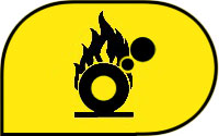
![[Oxidizer Symbol]](/images/danger-oxidizer.jpg) |
Ooh! A flaming volleyball! Didn't God appear as a flaming volleyball
at some point? I think it was the Book of Tracheotomy or something.
Well, if he did, apparently he was oxidizing like nobody's business.
There's really not much to recommend about this highly derivative danger
symbol. Isn't rust oxizidation, anyway? Should I have this symbol on
the good silver? D
|
![[Laser Symbol]](/images/danger-laser.jpg) |
Laser energy, possibly the coolest dangerous thing there is, gets a
really sad warning icon. I don't even get what that Christmas tree
ornament thing is supposed to be. Is that the laser generator or
someone's eye being reduced to its constituent humours? I'm not
sure a laser warning symbol is useful, anyway. I have it on good authority
that most industrial laser beams aren't visible unless you're looking
straight into the laser device, so basically we have a situation where
peering around for the source of the hazard is the last thing you want
to do. Maybe the sign should say "Danger: Really Boring Area! Don't
Look Around Or Anything! It's Tedious! Just Keep Examining Your Cuticles
And Considering The Switch To Low-Fat Sour Cream!" D-
|
![[Electric Shock Symbol]](/images/danger-shock.jpg) |
I don't get this. The lightning bolt is a universal symbol of electricity,
dating back to cave paintings and Captain Marvel serials. So why stick
the little arrow on the bottom? It just makes it look like "Warning:
Poorly Drawn Revenue Chart From A Business Cartoon." Certainly that's
something that merits a warning, but you don't want to be looking
around for hazardous clip art when there are live wires about. It's
all about focus. D+
|
![[Generic Symbol]](/images/danger-generic.jpg) |
"Caution: Interjection! Shows Excitement! Or Emotion! Hallelujah!"
I appreciate the need for a generic danger sign. You never know when
you're going to be in charge of some danger never before known to
man, like sentient pudding or something, but an exclamation point
doesn't mean "Danger" to me. It means "Charlie Brown is startled."
Perhaps we need to go back to the traditional sign of impending
danger: human heads on poles. They'd have to be sturdy poles, and
well-attached heads, though, or else you're going to need a
"Danger: Human Heads on Poles" sign. That would be too weird. D+
|
|


![[Flammable Symbol]](/images/danger-flammable.jpg)
![[Explosive Symbol]](/images/danger-explosive.jpg)
![[Oxidizer Symbol]](/images/danger-oxidizer.jpg)
![[Laser Symbol]](/images/danger-laser.jpg)
![[Electric Shock Symbol]](/images/danger-shock.jpg)
![[Generic Symbol]](/images/danger-generic.jpg)